

01 · Calmly clear
Make complex financial infrastructure feel simple and understandable. Use plain language, short sentences, and explain technical ideas without sounding technical.
Example
Send money anywhere in seconds. No bank account needed.
(c)2026
Moony is a modern digital cash and payments brand that turns complex blockchain infrastructure into something warm, simple, and easy to trust. Built and supported by an independent nonprofit foundation, it focuses on access, inclusion, and everyday usability rather than speculation.
Rooted in the ⍜ symbol and a sunset-to-moonrise narrative, the visual identity leans on clean structure, generous space, and a refined purple core. Subtle tonal shifts and soft detailing create a calm, contemporary system that feels credible for fintech yet friendly and slightly playful in character.
Use the approved artwork at every size. The examples below show the main logo, logomark, and logotype stepping down from large-format applications to compact digital use.
 W:512pxW:320pxW:160pxW:96px
Minimum width 96 px
Digital Media (Web, App, Social, UI)
Define the smallest size the mark may be used at, so it stays legible everywhere.
| Context | Minimum Width | |
|---|---|---|
| Website UI (navbar, footer) | 96 px | |
| Favicon / icon only | 32 px |  |
| App icon (symbol) | 48–96 px |  |
| Social profile image | 180 × 180 px |  |
To us at Moony, collaboration starts with clarity. When our logo appears alongside partners, we ensure it is always legible and respectful of space. The clear zone defines the breathing room our brand needs to stay recognizable and consistent, no matter the layout. Whether vertical or horizontal, the spacing standard helps maintain visual harmony in every partnership touchpoint.
Do not alter the logo. Avoid the following treatments.
Don’t stretch or distort the logo.
Don’t outline the logo.
Don’t use unapproved colors.
Don’t apply shadows or effects.
Don’t rotate the logo.
Don’t apply patterns or textures.
Moony’s color system combines a refined violet core with gentle peach tones and neutral whites and greys. The palette is designed to feel soft, calm, and approachable while remaining clear and legible in product and communication use.
Always maintain sufficient contrast by adapting the logo color to the background value: use darker marks on light surfaces and lighter marks on dark surfaces. For both solid and gradient applications, primarily use the specified color values to keep Moony’s appearance consistent, recognizable, and visually balanced across all media.
When combining the logo with brand colors, always ensure there is ample contrast. These are the approved light and dark combinations.

The Moony typography system uses General Sans to mirror the brand’s calm, modern character. Headline styles use General Sans Medium with tight spacing to create a confident, clear presence in key moments. Sub-headline and body copy use the same family for consistency, with increased line height for comfortable reading across product, web, and communication layouts.
Using a single, versatile type family keeps the experience simple and cohesive, ensuring that color, iconography, and layout can carry the brand’s warmth while the typography remains clean, neutral, and highly legible.
Primary
General Sans
Glyphs
Font style 12
Aa123
ABCDEFGHIJKLMNOPQRSTUVWXYZabcdefghijklmnopqrstuvwxyz0123456789!@#$%^&*()?+
| Scale Category | Typeface | Weight | Size | Case |
|---|---|---|---|---|
| Caption | General Sans | Medium | 12 | Sentence |
| Header 1 | General Sans | Semibold | 96 | Sentence |
| Header 2 | General Sans | Medium | 60 | Sentence |
| Header 3 | General Sans | Regular | 48 | Sentence |
| Body copy | General Sans | Regular | 16 | Sentence |
| Small text | General Sans | Regular | 12 | Sentence |
| CTA | General Sans | Regular | 16 | Sentence |
Moony imagery should feel warm, open, and quietly optimistic. Use soft light, generous negative space, tactile detail, and calm compositions that move from sunset warmth toward moonlit violet. Avoid generic fintech stock photography, visual noise, harsh contrast, and imagery that relies on hype or speculation.
Moony speaks with calm clarity, radical openness, and warm confidence. We make complex ideas easy to understand, support every claim with transparent facts, and treat people as capable participants in an open network.
Our language is concise, human, and globally accessible. We communicate the practical value of Moony without hype, speculation, or unnecessary technical jargon.
Make complex financial infrastructure feel simple and understandable. Use plain language, short sentences, and explain technical ideas without sounding technical.
Send money anywhere in seconds. No bank account needed.

Earn trust through facts, transparency, and verifiability. Be specific about how the system works, who is involved, and what people can verify for themselves.
The supply is fixed at 21 million. The public code cannot be changed.

Speak to people as capable participants, not passive customers. Be welcoming, inclusive, and optimistic while staying grounded.
Your money moves with you—across the room or across a border.
Website and campaigns: Optimistic, simple, and led by practical benefits.
Product UI: Brief, direct, and reassuring.
Education and support: Patient, conversational, and never patronizing.
Social and community: Warm, participatory, and lightly playful.
Protocol documentation: Precise, neutral, and verifiable.
Safety, policy, and legal: Factual, calm, and unambiguous.

Be clear, specific, human, and useful.

Use hype, speculation, insider language, or exaggerated promises.
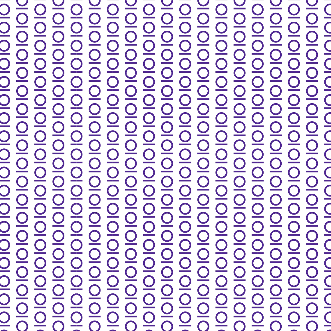
Moony’s brand patterns extend the ⍜ symbol and wordmark into repeatable layouts that feel rhythmic, calm, and distinctly recognizable. Patterns can use the icon alone or combined with the logotype, always following the core spacing and alignment rules of the system. They are best applied at a scale where the individual marks remain clear but read as a continuous field—ideal for social templates, backdrops, and subtle texture. Avoid over-crowding other content; patterns should support, not compete with, key messages.
The use of brand patterns must utilize two colors with strong contrast. Daisy Bush is the primary pattern color, while Rich Tone and Full White can be used as supporting object colors.
Moony’s gradient system translates the sunset-to-moonrise story into soft, ambient backgrounds that support the logo without overpowering it. Each gradient blends gentle peach and violet tones with smooth transitions, creating a calm, atmospheric field that keeps focus on the mark. Use the dark Moony icon as the default on gradients to ensure clear legibility at all sizes. Gradients should feel subtle and airy rather than intense or high contrast. Apply these treatments consistently across hero panels, social avatars, and key brand surfaces to keep the visual language cohesive and recognizable.







Brand strategy · Digital experiences
Ideas made visible. · moony.org